
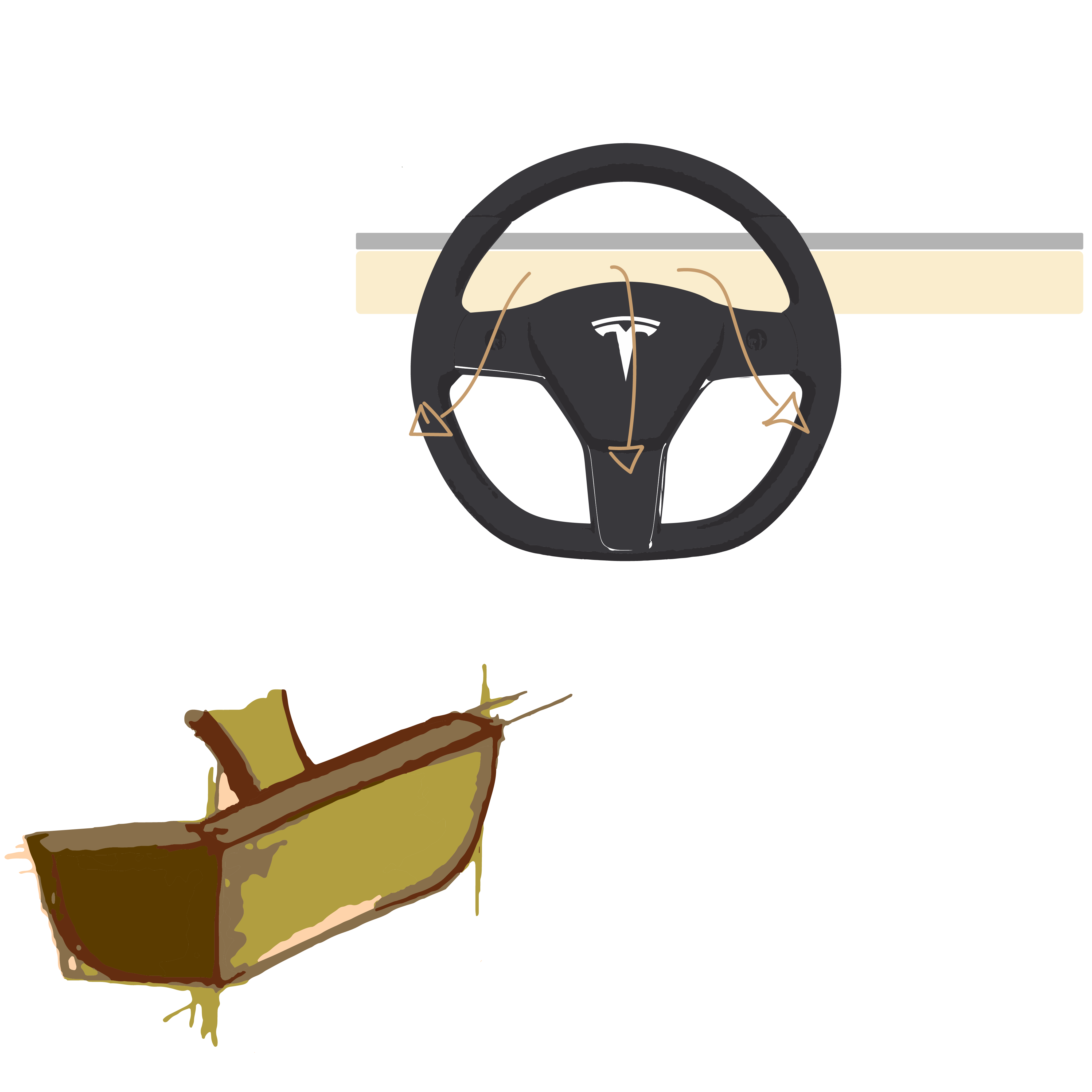
Combatting ‘Highway Hypnosis’
Tesla Alerts for Navigation · 2026
An exit cue for drivers who muted their navigation and stopped noticing their exits. Problem, GIS research, and concepts below; the final solution is still in progress.
The exit you miss because you turned the voice off.
An hour into a highway drive, music on, navigation muted. The sign arrives and you are already a lane or two short: let the exit go, or cut three lanes in a few seconds.
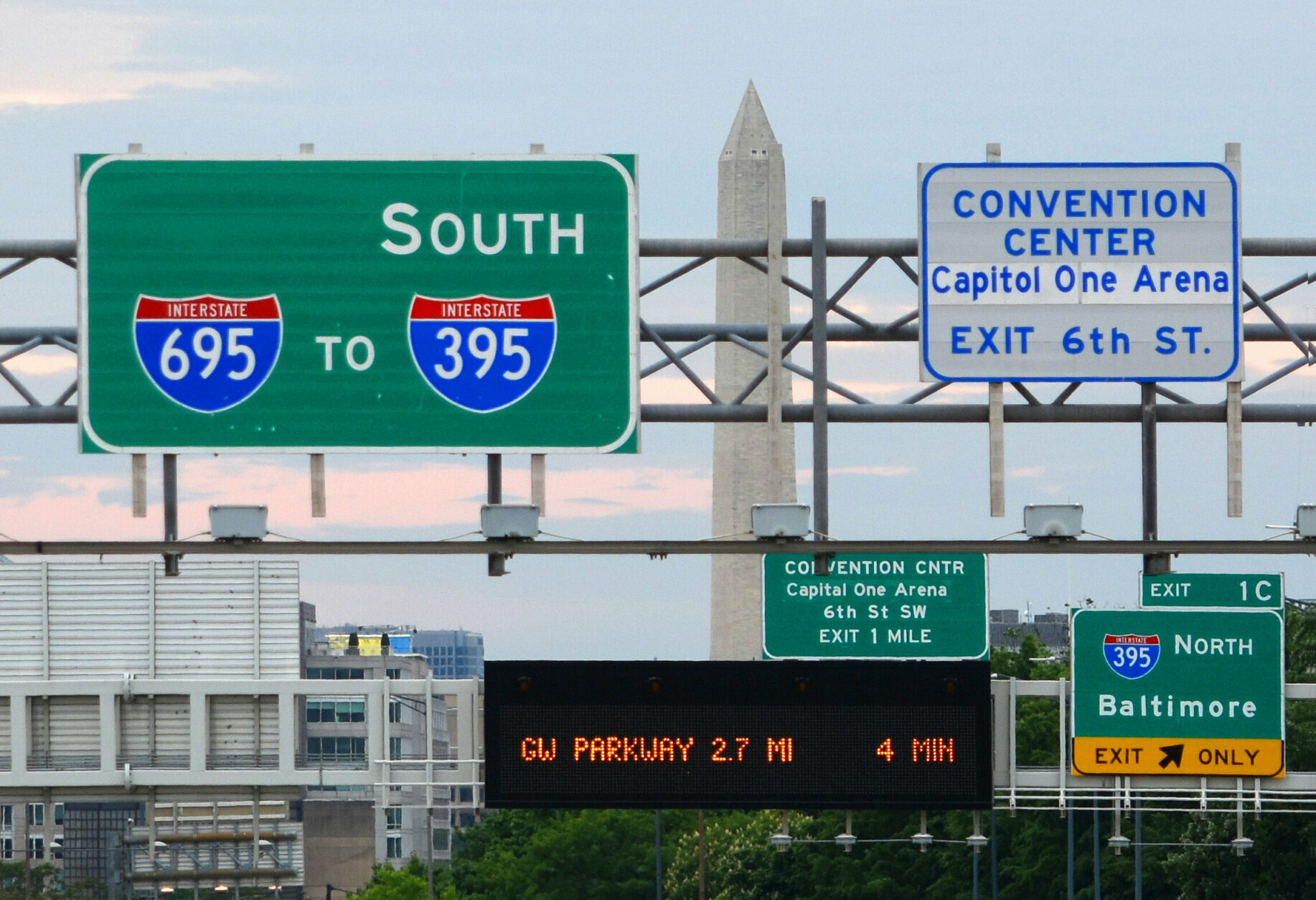
Two channels, both down.
The audio channel is off on purpose, because turn-by-turn voice ducks the music. The attention channel wears down on its own: monotonous highway driving produces highway hypnosis↗, where a driver runs on prediction instead of what is in front of them. Both fail on the same drive.
 10–20%
of road accidents are estimated to be fatigue related.
10–20%
of road accidents are estimated to be fatigue related.
 20–50%
for commercial vehicles, where the monotony is unbroken.
20–50%
for commercial vehicles, where the monotony is unbroken.
On the drive where attention is dullest, the one system still warning you is switched off.
Mapping the problem in California.
Two maps built in Python from the same OpenStreetMap data, asking two different questions of one road network.
How interchange-dense is this stretch right now? Across 9,471 freeway segments, the red decision-heavy stretches land everywhere with no real pattern — heaviest in LA and Oakland, where several interstates converge inside a city grid.
Did this stretch just come out of 25+ miles of monotony before hitting a dense cluster of exits? A strict subset of Map 1, filtered by sequence instead of raw density.
of CA highway segments qualify — 121 out of 8,231.
The danger is the seam, not either condition.
An empty stretch is not dangerous alone, and a cluster of exits is not dangerous alone. It is monotony immediately followed by density — 1.5% of the network, on some of the state’s busiest corridors.
I built this around rural semi-truck hauling. The GIS corrected me: hypnosis zones cluster at urban and border interchanges. Both drives are equally monotonous going in; only one drops you straight into dense, fast traffic.

A cue that fires in only 1.5% of situations is quiet enough to earn a driver’s trust.
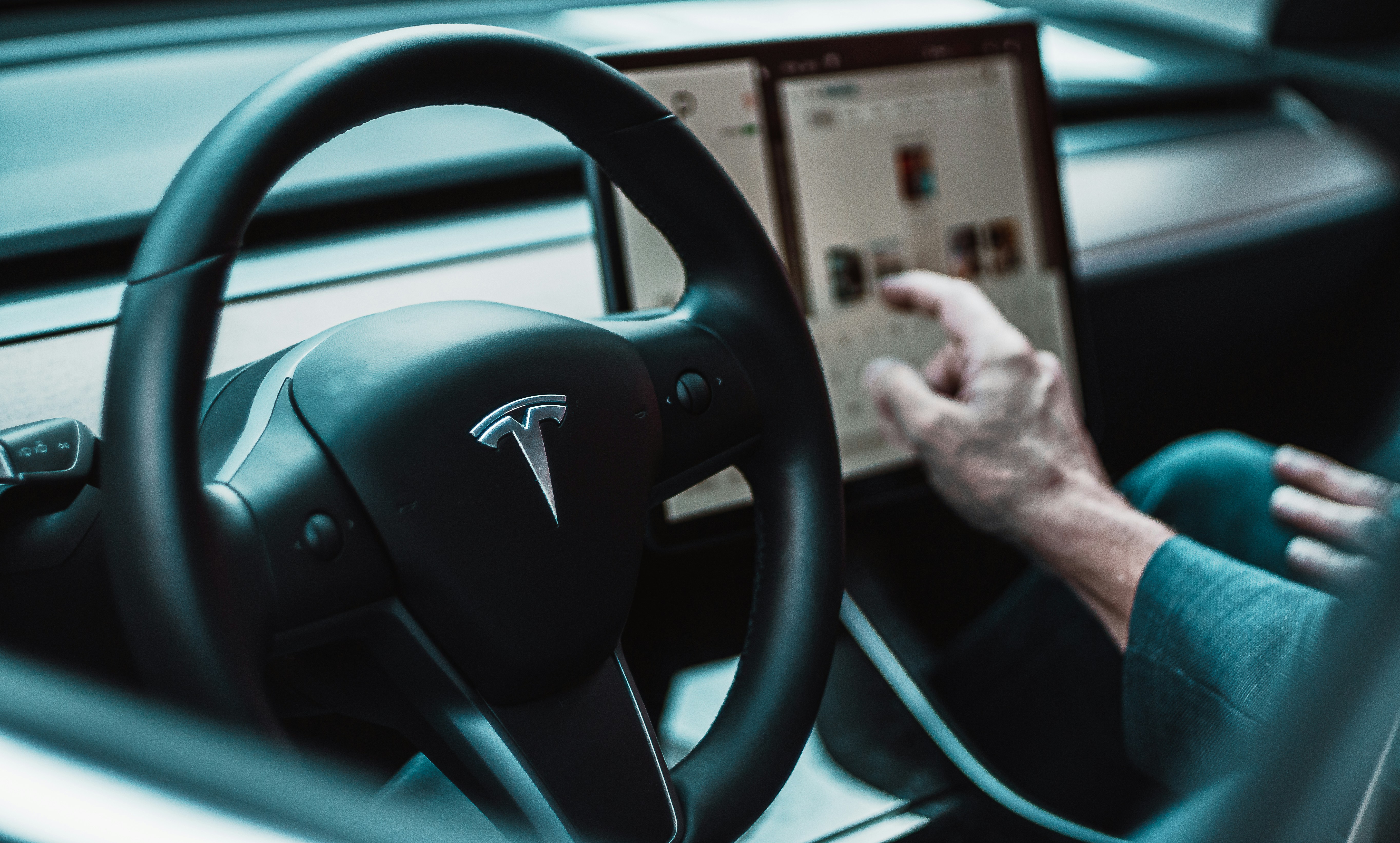
Tesla has no good place to put the cue.
Everyone else runs three cues at once: a turn card that stays up, lane guidance, and audio that escalates at two miles, one mile, and just before. Through CarPlay they sit in the driver’s sightline. Tesla opts out of all of it — the next turn lives in the corner of the centre screen, the farthest point from the road.
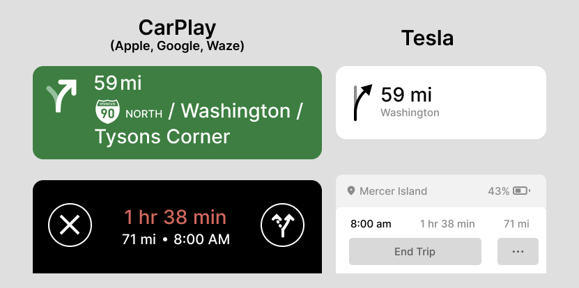
The next maneuver, the one thing needed at a glance
Route and energy state instead
Mimics real highway signage — match the screen to the sign, done
Neutral, low-contrast system UI — read it, then translate it
The visual card still carries the cue on its own
The cue collapses — exactly the gap this feature closes
CarPlay keeps the phone’s screen, GPS and radio live, draining it
Sharper and faster than most built-in systems, no lag
N/A — an app does not drive the car
FSD can take the lane change itself
A tradeoff, not a flaw.
The single screen is the brand: one clean surface, no cluster, updated over the air. For almost all driving it works. Highway exits are the edge case where that centralisation costs, because there is no fallback surface in the sightline. Not a data problem — a philosophy tuned for simplicity, never tuned for this glance.
The moment, mapped.
Before picking a surface, I mapped what the driver is doing right before, during, and after the cue fires.
Long monotonous highway. Music on, navigation voice muted.
The car crosses into a flagged hypnosis zone.
A low, easy-to-ignore signal starts well before the exit.
It grows more present as the exit closes, never a startle.
Taken or let go, the cue clears once the moment passes.
Where the cue could live.
Three surfaces the car already has, and one it does not. Each judged on fit to the constraints above, and on how likely Tesla would be to build it.
The main interface
The centre touchscreen is the surface Tesla already owns and ships to over the air. No new hardware, so it is the change most likely to actually happen.
The rear-view camera as an interface
Every Tesla already has a second screen, dormant outside of reversing. It needs no new hardware either — only a reason to wake while driving forward.
The ambient light strip
The dashboard strip is purely decorative today. It sits in peripheral vision without asking for a glance, which makes it a natural directional cue.
Tesla Dash
A dedicated driver-facing display, brought back as its own screen instead of folded into the centre. Least realistic to ship, cleanest fix — it puts the cue where the eyes already are.